


The New York Yankees are one of the most iconic and successful baseball franchises in history. With a rich legacy spanning over a century, the team has not only dominated the sport but also left an indelible mark on American culture. Central to this legacy is the Yankees logo, a symbol that has evolved over time while maintaining its core identity. This article delves into the history and evolution of the Yankees logo, exploring its design changes, symbolism, and significance.
The Origins of the Yankees Logo
1901—The Orioles Logo
The Yankees’ journey began in 1901 as the Baltimore Orioles. The first logo was a bold letter “O” in orange and black, representing the team’s original name. This simple yet striking design was used for just one season before the team relocated to New York City.
1902—The Baltimore Logo
![]()
In 1902, the team adopted a new logo featuring a “B” in blue and white, referencing the city of Baltimore. This geometric design was clean and professional, reflecting the team’s early identity.
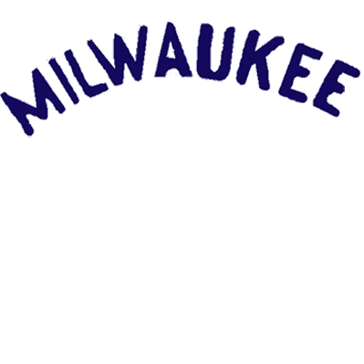
1903—The Black New York Logo
As the team moved to New York, the logo changed to “NY” in an Old English font. This design marked the beginning of the team’s transition from the Orioles to the New York Highlanders.
The Interlocking NY Era
1905—The Interlocking Logo
One of the most significant changes came in 1905 with the introduction of the interlocking “NY” logo. Designed by Louis Tiffany, this emblem became a hallmark of the Yankees and would evolve over the years.
1909—The Stylized Interlocking Logo
In 1909, the interlocking “NY” was stylized with bold sans-serif letters. This design, inspired by a medal of valor created in 1877, became a lasting symbol of the Yankees.
The Circular Logo Era
1947—The Circular Logo
In 1947, the Yankees unveiled a new circular logo featuring an Uncle Sam hat, a baseball bat, and the word “Yankees.” This design, created by Henry Alonzo Keller, reflected the team’s patriotic spirit and remained in use for two decades.
1968—The Current Logo
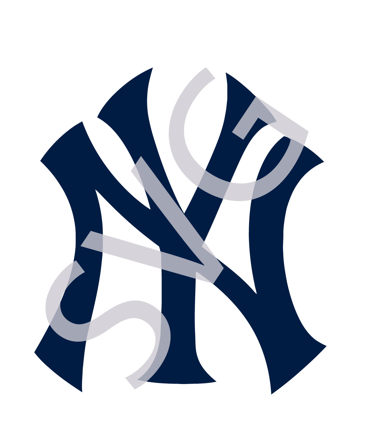
The current Yankees logo, introduced in 1968, features a circular red emblem with a white background. It includes the interlocking “NY” and a baseball bat, symbolizing the team’s connection to the sport. This design has become one of the most recognizable logos in sports history.
Why the Yankees Logo Works
1. Attractive Design
The Yankees logo is visually appealing, with a vibrant color scheme that captures attention. Its design elements make it instantly recognizable, helping to build brand loyalty among fans.
2. Unique Identity
The logo stands out in a crowded market due to its distinctive design. The interlocking “NY” and the use of a baseball bat set it apart from other sports logos, reinforcing the team’s unique identity.
3. Readable Typography
The choice of typography ensures that the logo is easy to read across various media. This readability is crucial for marketing and branding purposes, making the logo effective in different contexts.
4. Memorable Features
The simplicity of the logo makes it easy to remember. Fans can quickly identify the Yankees logo, which helps in building a strong brand presence.
5. Relevant Symbolism

The logo incorporates elements that are directly related to baseball, such as the baseball bat and the interlocking “NY.” These symbols reinforce the team’s connection to the sport and its heritage.
Design Elements of the Yankees Logo
Oval Shape
The oval shape of the Yankees logo represents fertility, rebirth, and family. It also conveys a sense of unity and wholeness, reflecting the team’s commitment to its community.
Hat Symbol
The hat in the logo, reminiscent of Uncle Sam, signifies protection and authority. It adds a layer of symbolism that resonates with the team’s historical and cultural significance.
Circle
The circular design of the logo symbolizes totality, perfection, and eternity. It reflects the team’s long-standing legacy and enduring presence in the world of baseball.
Baseball Bat
The baseball bat in the logo represents the team’s dedication to the sport. It serves as a reminder of the team’s roots and its ongoing commitment to excellence.
Color Scheme
Orange
Orange, used in the team’s earliest logo, symbolizes joy, success, and creativity. It represents the team’s vibrant energy and passion for the game.
Black
![]()
Black, a recurring color in the Yankees logo, signifies power and strength. It adds a sense of authority and dominance to the design.
Blue
Blue, often associated with the sky and ocean, represents freedom, inspiration, and wisdom. It contributes to the team’s stable and confident image.
Red
Red, introduced in 1947, symbolizes desire, passion, and strength. It adds a dynamic element to the logo, reflecting the team’s competitive spirit.
White
White provides balance and contrast to the other colors in the logo. It signifies goodness, safety, and perfection, enhancing the overall visual appeal of the design.
Who Created the Yankees Logo?
Louis Tiffany created the stylized interlocking “NY” in 1909, which became one of the most iconic trademarks in the sporting world. In 1947, Henry Alonzo Keller developed the circular Yankees emblem, further solidifying the team’s visual identity.
Font Used in the Yankees Logo
The font used for the interlocking “NY” is custom, ensuring a unique and recognizable look. The current logo features a brush script similar to the Machiarge Regular Font, known for its elegance and readability.
The Meaning Behind the Yankees Logo
The Yankees logo is more than just a symbol; it embodies the team’s values of patriotism, sportsmanship, and community. Each design change reflects the team’s evolution while maintaining its core identity.
Copyright and Ownership
The Yankees logo is protected under copyright law, registered on October 23, 2007, under the name Mary L. Kelvin. It is owned by the New York Yankees Partnership and is a valuable asset for the franchise.
The Legacy of the Yankees Logo
The Yankees logo has played a crucial role in the team’s success, becoming a symbol of excellence and tradition. Its evolution over the years reflects the team’s journey and its enduring impact on the world of baseball.
Conclusion
The Yankees logo is a testament to the team’s rich history and enduring legacy. From its humble beginnings as the Baltimore Orioles to its current status as one of the most recognizable logos in sports, the Yankees logo has undergone significant transformations while maintaining its core identity. Its design elements, symbolism, and color scheme all contribute to its effectiveness as a brand identifier. As the Yankees continue to dominate the sport, the logo remains a powerful symbol of their success and tradition.
Meta Title: Yankees Logo History – A Deep Dive
Meta Description: Explore the evolution of the Yankees logo, from its origins to the iconic design we know today. Learn about its symbolism, design elements, and significance in baseball history.
CTA: Stay updated with the latest news on the Yankees and their iconic logo. Follow us for more insights into sports history and culture.


More Stories
US Trending News: The History and Legacy of Zoo York in Streetwear Culture
US Trending News: Exploring Zach Top Greensboro
US Trending News: Youngboy Concert in Birmingham: What to Know Before You Go